The need to professionalize our operaton.org web presence becomes more relevant, as we grow as a project and community.
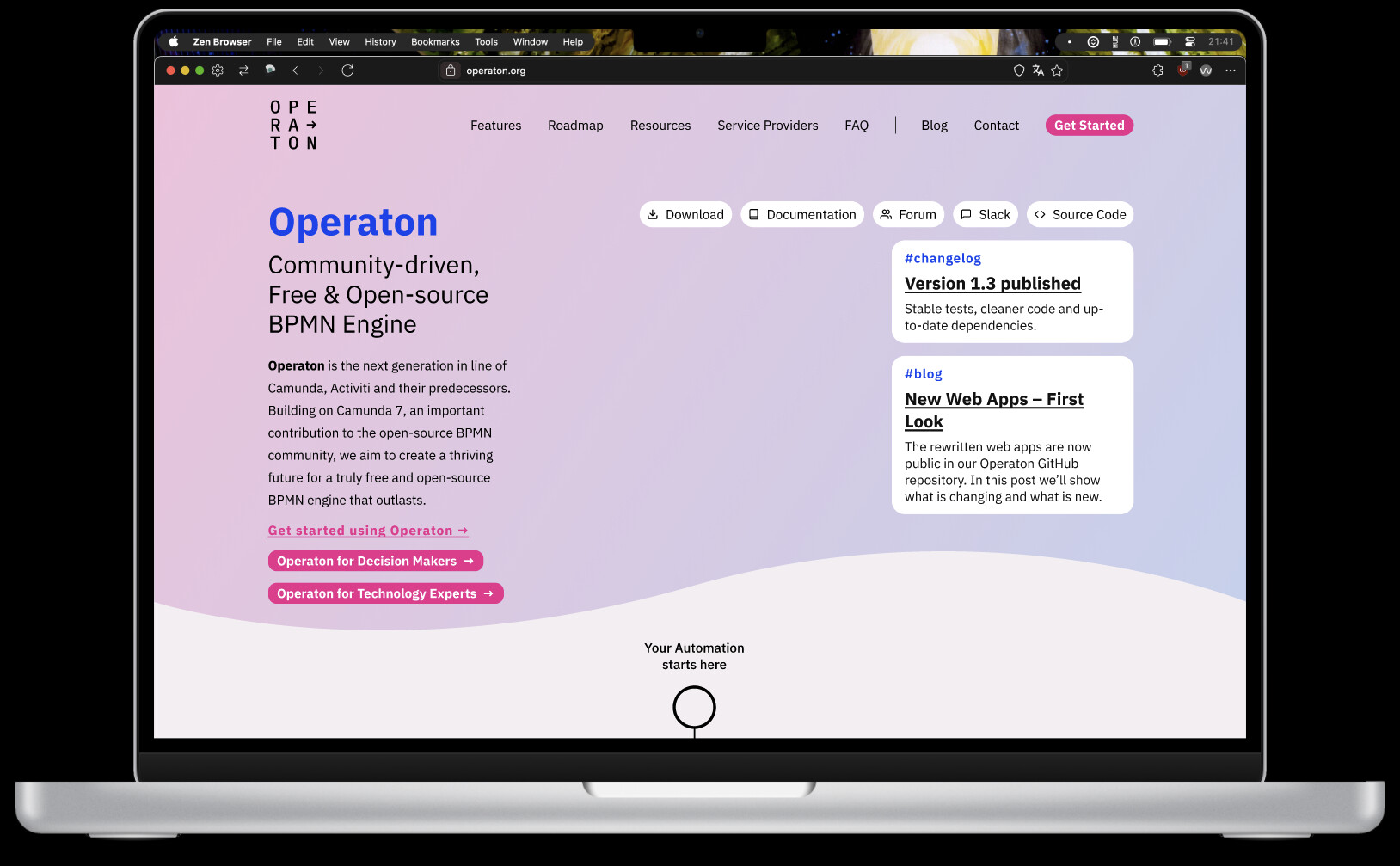
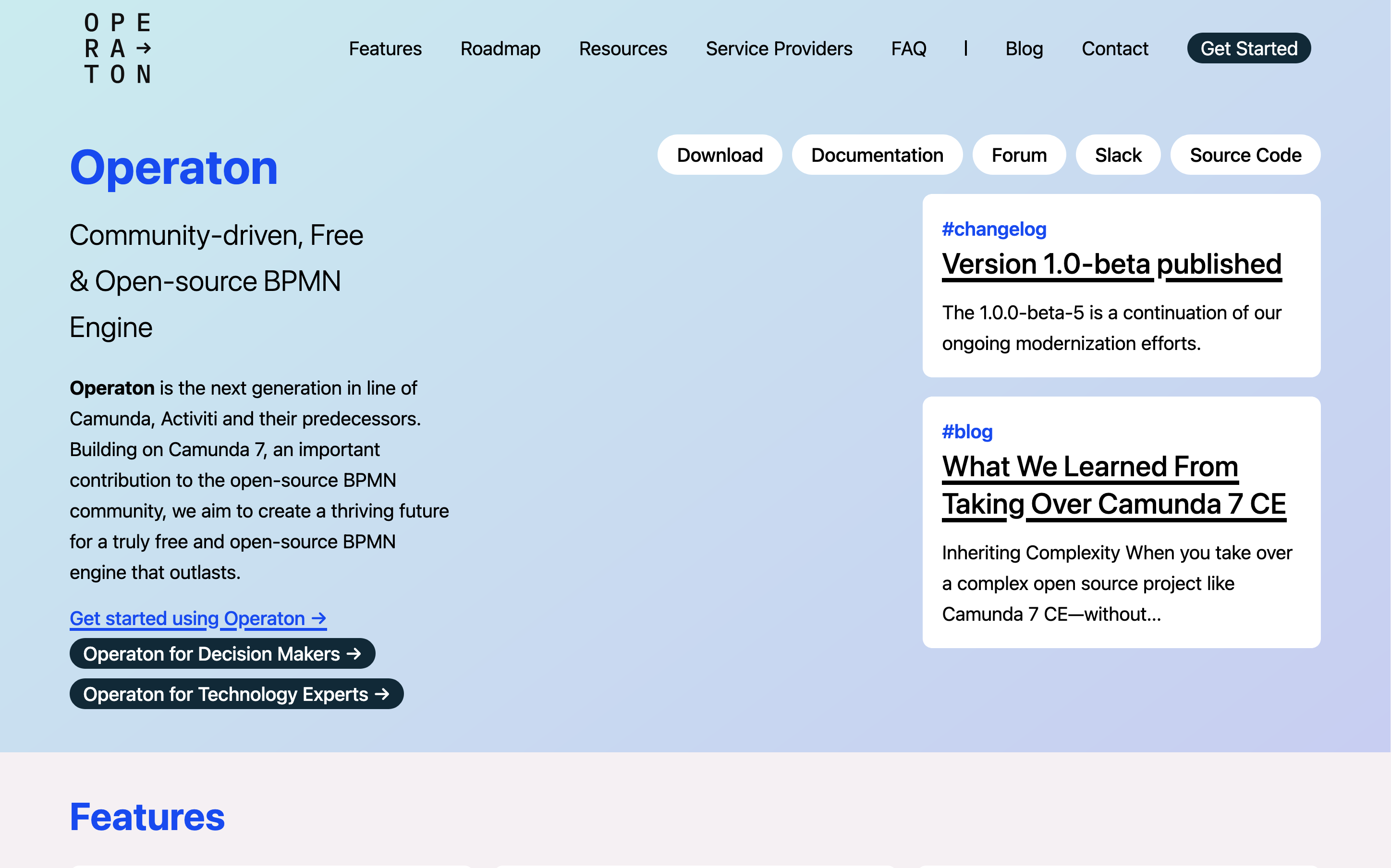
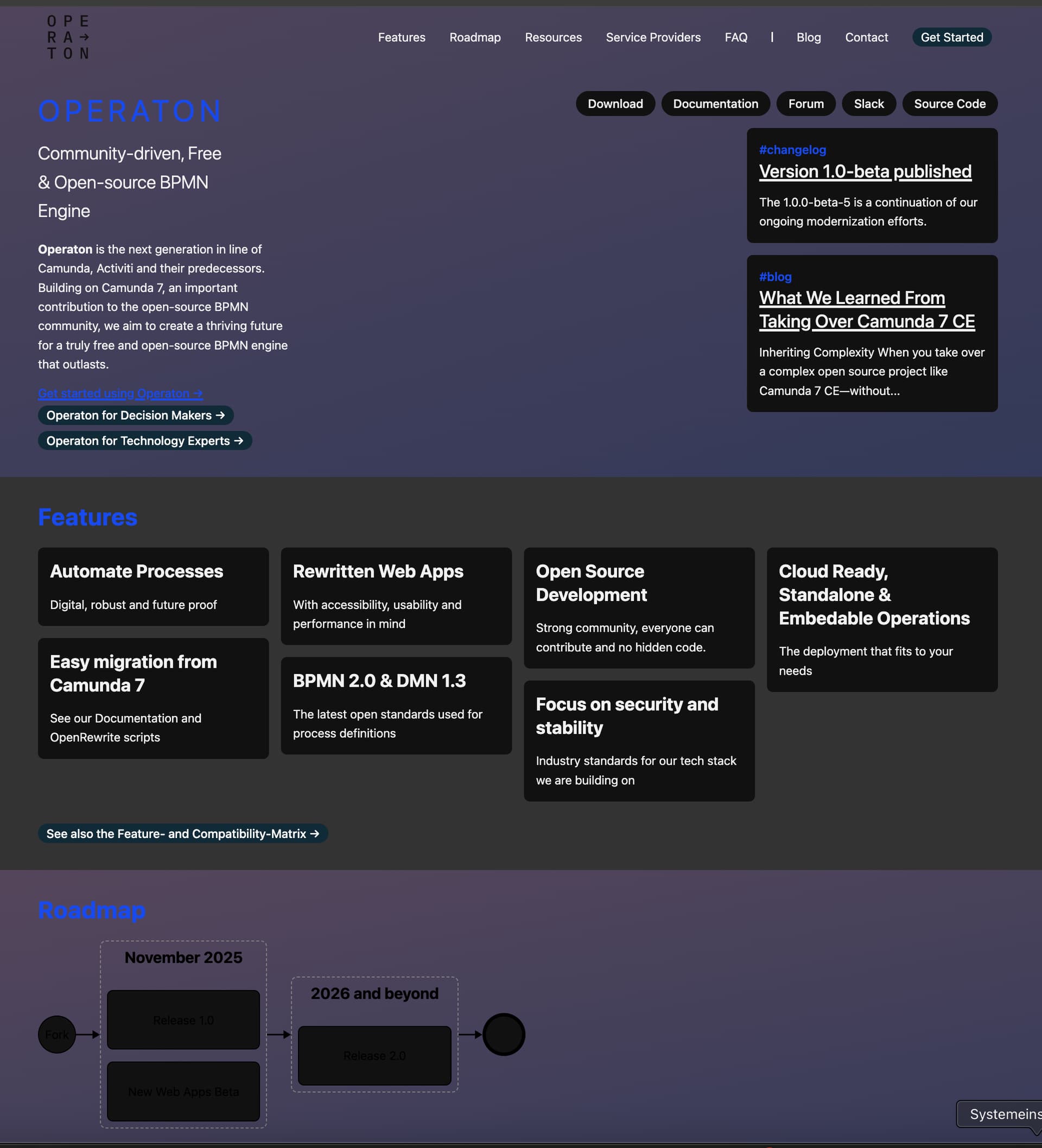
The first website iteration was about telling everyone, that we forked Camunda 7 as a community project, the second iteration about getting the content and the message right. The now proposed third iteration is about creating a design that is more appealing to interested technical and non-technical Operaton users, as well as revisiting the content and improving on it.
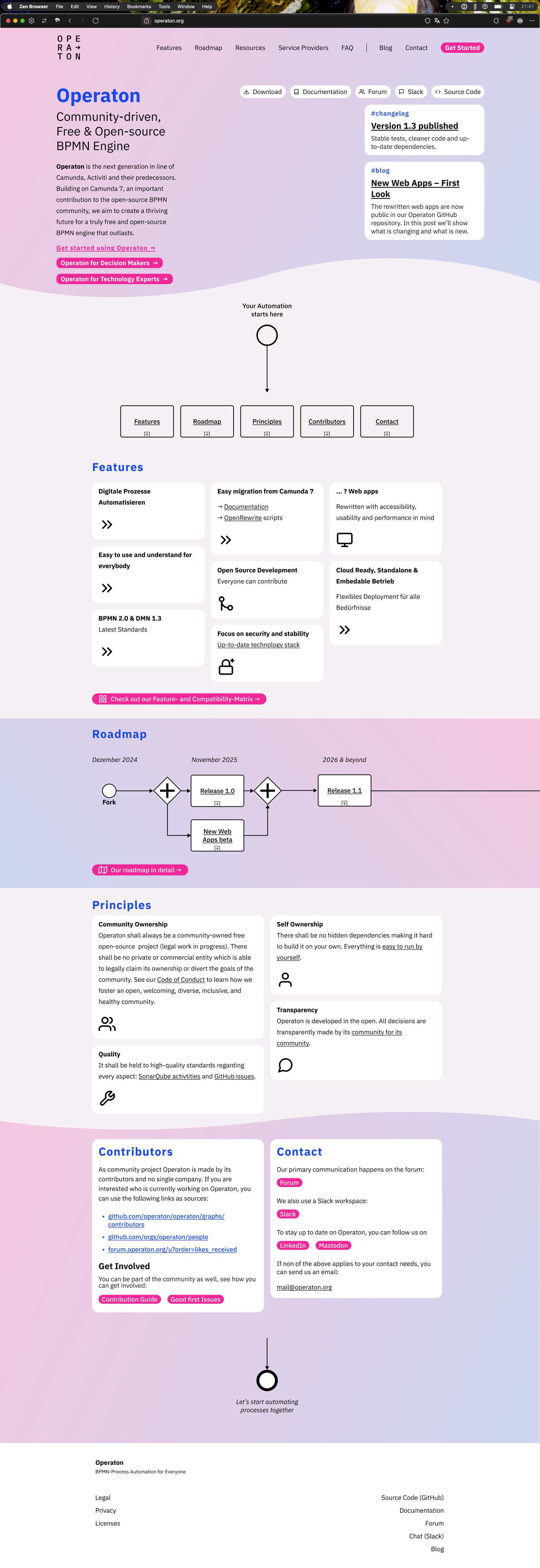
The main idea of the new website proposal
Friendlier: more colors, more appealing design
More creative (visual) elements
More positive formulated text (e.g. (“Operaton is the next generation…” instead of “It inherited its source code from the legacy of Camunda”)
Adress non-technical users more (aka. information for decison makers) → restructuring of the content (e.g. compare the current feature section with the mockup feature section)
Add more “Call to actions”, to get people to interact with the page and click around
Improve the usage of the first screen: most important content up top, everything visible at a glance
@kthoms and I took some time to create a first draft. Some things have to be finalized, but this is the perfect time for some community feedback. What do you think? What do you miss?
Thanks for the credits, but the initiative and work is all your achievement and hard work. I only gave some feedback which you already implemented. I really like the new draft. Would be great to advance here soon.
Yes, the magenta/cyan palette definitely gives me more of a “fancy lifestyle product” vibe. I’m not sure it has to be blue though. Blue feels like the safe, default choice (and I get why you’d call it boring) for a product like Operaton.
Alrighty, how do we want to review the text content of the redesign?
I changed a significant portion and would advice for at least one review.
Would anyone like to contribute? I can provide the rendered site in a zip package, if you don’t want to check it out (it can be run locally with docker)